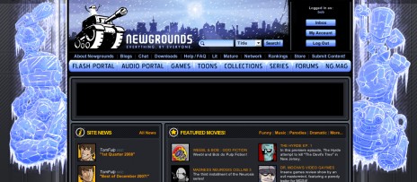
So it hasn't actually snowed more than half an inch yet ('round these parts, anyway), but we're finally ditching the Winter header theme. I guess people accociated it more with Christmas, which is fine since I was a little sick of it anyway. So down it comes.
The challenge is to make it more simple to update the header in the future. It's not difficult as-is, technically speaking, but processes could always be improved upon. I found that when every time I made a change to the site's main CSS file (ngsite.css), I had to make changes to the backed-up version of the file too, the one without the fancy holiday theme additions. It wouldn't have been a big deal -- and still wasn't that big of a deal anyway, technically speaking -- if it was for only a day or two, but using a swapped-out style sheet for an entire month was a bit of a hassle considering the amount of tweaks and edits I'd been doing.
So, I've been messing around with swappable themes, the kind where all we have to do is toss in an additional style sheet that would overwrite the necessary header styles and call new images altogether. This instead of combing through a dozen different styles spread across the existing code. Not only would it make it simpler for me -- having all the styles in one handy place and not requiring me to edit multiple sheets for each change -- but it would be simpler for Jim and Ross too since there wouldn't be any timing issues. The art could be moved into a special holiday directory and the new style sheet could be added to the queue first, and then the script to activate the changes could be run at a later time. All around a simpler method.
The question remains whether there will be a noticeable glitch where the images are swapped out. For example, a user's browser loads the default header styles (which also call the new images) then load all the other styles in that first sheet. Will the browser display those images first, then swap them out for the updated styles a microsecond later? Or will it wait to see what the ultimate result is before rendering anything at all. I'm guessing it's the latter, but we won't know for sure until we test it out.
The reason I bring all this up now is because I've got the Peni-pals.com site set up to use a different skin for each section, and it's working out surprisingly well. I'm excited to use the technique elsewhere. It's a lot of extra code and a little bit of a headache but does help to keep things organized better.
Finally, a salute to our fallen header:

Sparkwattclock
thank you for changing the banner! No offense i just didn't like the winter one. The old NG colors are awsome. Hey bob your whistle is like mine it never changes from garbage.