bob's Banner
bob

Age/Gender: 32, Male
Location: Wyndmoor, PA
Job: Web Developer

I harness the power of Teh Intrenets.

Newgrounds Stats

Sign-Up Date:
8/29/03

Level: 17
Aura: Evil

Rank: Police Officer
Blams: 262
Saves: 268
Rank #: 15,669

Whistle Status: Garbage

Exp. Points: 3,130 / 3,210
Exp. Rank #: 8,291
Voting Pow.: 5.93 votes

BBS Posts: 613 (0.27 per day)
Flash Reviews: 156
Music Reviews: 13
Trophies: 2
Stickers: 0

Entry #5

Jump to Entry: [ 1 | 2 | 3 | 4 | 5 | 6 | 7 | 8 | 91827 ]


bob

A surprise for Tom

Posted by bob Aug. 24, 2007 @ 10:51 AM EDT

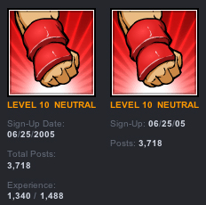
So we've made a change to the BBS today. I won't bother describing it since it's detailed in the accompanying image, but I will say I like it.

At first I was skeptical, since I was simply used to seeing it one way and it seemed like devoting time to such a small detail was a waste. But Tom was insistent and I agreed to mock it up for him eventually. Now after seeing it live I'm fully on board. No need to use 6 lines when 3 will do, and since Experience is just a further breakdown of Level anyway, it was extremely redundant.

The best part is that it's a surprise for Tom. He mentioned he really, really wanted it taken care of, but has no idea we made the change yet. When he logs on tonight after putting in a long day at PAX it'll be there to remind him that we're still working hard back east.

compare.jpg

Updated: 08/24/07 11:16 AM Log in to comment! | Share this!

The People Have Spoken

82 Comments

Aug. 24, 2007 | 11:06 AM jackmorrison says:

Everything looks a lot better now.

Aug. 24, 2007 | 11:13 AM bob responds:

Glad you like it. I just hope Tom doesn't change his mind again... I also hope that stamper doesn't get mind the change.


Aug. 24, 2007 | 11:06 AM DancingHitlur says:

Oh God, someone hole me...please...

Aug. 24, 2007 | 11:12 AM bob responds:

Holing someone sounds very, very dirty...


Aug. 24, 2007 | 11:07 AM PenisClown says:

Well.... I guess I can live with it. It makes everyone look better than what they are, so that's a plus.

Aug. 24, 2007 | 11:12 AM bob responds:

better how?


Aug. 24, 2007 | 11:15 AM G-Banger says:

Experience going is okay, but I did like headings having their own line with info being under it. Really though, I don't care enough either way.


Aug. 24, 2007 | 11:35 AM BFK says:

In firefox, the stats are on a different line as the indicator(like in the first pic), rather than next to it (like in the second) so it takes up 5 lines instead of 3. Thought I'd point that out. Otherwise, it looks much better :)

Aug. 24, 2007 | 11:51 AM bob responds:

refresh! (you're still using the old CSS)


Aug. 24, 2007 | 11:45 AM jackmorrison says:

Get mind the change???

Aug. 24, 2007 | 11:53 AM bob responds:

yeah, it kinda worked out like that. I did notice it after i typed it!


Aug. 24, 2007 | 11:50 AM Noodleboy111 says:

I didn't even notice.

I guess that's good.


Aug. 24, 2007 | 12:07 PM Frank-The-Hedgehog says:

So do you feel like you should add something down there now that you have space? I don't know, You can do it I guess...


Aug. 24, 2007 | 2:06 PM Fr0z3nb14d3 says:

I still think experience would be nice to have. If you put it in as just the amount you've deposited and not as a fraction, it wouldn't take up alot of room. I think you'd agree. Especially since some levels take a couple thousand experience to attain.


Aug. 24, 2007 | 2:06 PM Jin says:

The aura name could be removed too, since the icon already shows it.

Aug. 24, 2007 | 4:22 PM bob responds:

not for mods and admins, it doesn't...


Aug. 24, 2007 | 2:07 PM citricsquid says:

Cute :D


Aug. 24, 2007 | 2:14 PM kidray76 says:

Counts down till Tom makes a post and/or news thread about it. Good job as usual. !@


Aug. 24, 2007 | 3:31 PM marshall159 says:

awsoem go bob


Aug. 24, 2007 | 9:09 PM k14pc says:

It looks better this way. I was wondering what was missing when I posted on the BBS. Exp points don't really matter with posting anyway since people can just look at your icon/lvl.


Aug. 24, 2007 | 9:14 PM Sanjay says:

I actually liked seeing the EXP total along with the post and sign up dates. Not only was it a clear way to see how soon someone was to leveling up, but I don't really think it was that cluttered to begin with.


Aug. 24, 2007 | 9:31 PM gamerpeepinpa says:

Ah, much better. No one seems to be interested in looking at people's exp when on the BBS anyway.


Aug. 24, 2007 | 10:20 PM X-Naut says:

asjdgfsaj THIS RUINS THE WHOLE NG EXPERIENCE FOR MEH. I'MMA GO LEAVE NOOGRUNDS NAO.

But I do like how it is less cluttered around that area now. Makes it look better.

Also, those are some narrow sunglasses you have thar.

Aug. 24, 2007 | 11:28 PM bob responds:

Heh. JohnnyUtah did all the caricatures and gave me those crazy things. I do have glasses like them, but they're not quite as thin and definitely a lot less Elton John.


Aug. 24, 2007 | 11:45 PM SUG4R-F13ND says:

This is better for some strange reason because in the forums exp. isnt really important,for me anyways.


Aug. 24, 2007 | 11:59 PM Ecke says:

Sigs better be fucking bigger, then.

Aug. 25, 2007 | 1:02 AM bob responds:

sir yes sir?


Aug. 25, 2007 | 12:20 AM Rudy says:

You're simply amazing, Bob. Really.


Aug. 25, 2007 | 1:10 AM eyeothestorm says:

Oh ok, I thought something was wrong with my computer. Love'n the new look more and more.


Aug. 25, 2007 | 1:31 AM wismty says:

NOOOO YOU MONSTER!, I LIKE SHOWING OFF MY EXP WHEN POSTING!!!

Couldn't you just remove the sign up date?

</3

Now seriously.

Why did Tom ask for this and not to fix the dead Flash & Movie review links found in our profiles, or something that's actually worth taking time to do?

:S

Aug. 25, 2007 | 1:47 AM bob responds:

Well, because ROSS AND JIM work on things like that, and TOM AND I work on little visual things. GOT IT?


Aug. 25, 2007 | 2:19 AM Shawn says:

Well, I say we get are 10 extra pixels back for our sigs instead of this crazy 50 pixels.... I miss 60....


Aug. 25, 2007 | 2:46 AM snayk says:

It looks alright, but I've got to admit, I'm not quite used to it, yet. I actually used to look at experience (out of curiosity) just to see where users stood -- how close or far they were from their next level. I know I could see that just as easily by going into their profiles, and I could get used to that.

But I'll probably just stop looking at experience points completely :P


Aug. 25, 2007 | 10:21 PM bob responds:

There are so many things wrong with that mock-up I can't even list them all. For starters, how about that guy using consistent margins?


Aug. 25, 2007 | 5:56 AM Sarai says:

Looks a bit better :)

I'd love a working search bar... And also a ban from multiple voting by one person on an audio track... (Used to be one vote only)

:)

Aug. 26, 2007 | 8:26 AM bob responds:

search bar works for me


Aug. 25, 2007 | 7:34 PM BlueHippo says:

wow, i knew they were a lot shorter, but i didn't see them side by side :0 totally shortens those frames, awesome. as i posted in another thread, we don't really need EXP any more under our posts, since we are all different levels, unlike before the redesign :P

keep up da good work ^_^


Aug. 26, 2007 | 12:15 AM bifgis says:

I hate it.

(sorry, but I do)

Aug. 26, 2007 | 8:26 AM bob responds:

you won't even notice in 2 weeks.


Aug. 26, 2007 | 6:03 PM ZenithSpade52 says:

God, I don't care how it's put. It's fine any way it is.


Aug. 26, 2007 | 6:40 PM Mufakamills says:

I was wondering what was missing, I don't pay much attention to that side of the screen anyways.


Aug. 26, 2007 | 10:28 PM gfoxcook says:

I just replied to a question of yours in the topic that's about this change to our avatar-areas on the BBS, but I'm the first person to post there in two days, it's now on page 3, and you hadn't replied since page 2, so I figure you wouldn't see it for sure:

You asked "Why is it important to know exactly how much exp a person has?" and my answer was that it isn't, really, but it was nice to know how close a user is to leveling up, though. IOW, I thought the best thing about that line showing up next to everyone's post on the entire BBS wasn't seeing their exp, but noticing how close their exp was to the XTNL (exp to the next level) amount.

You could achieve the same effect with a xx% type indicator. Maybe in place of the "NEUTRAL" or whatever aura name, a little "88%" to indicate the user is 88% done with that level. :::shrugs:::

Aug. 27, 2007 | 7:49 AM bob responds:

I'll propose it to Tom and see what he says. Interesting idea.


Aug. 27, 2007 | 2:55 PM niaR says:

Gfoxcook has a great idea, bob. But anyways, when I just got onto NG a few days ago, I noticed a change... But I couldnt quite tell what it was. I noticed that something in the avatar was missing, but still, I didnt remember what it was. Then, when i realized my EXP thingy was missing from my avatar, I was a lttle upset. Maybe because i was too used to it... Still, I bet a few weeks from now, I wont even notice it. (Just like "Tank_smallGIF" or whatever the hell that thing was). All in all, I think that if Tom wants it, that we should be happy you did something nice for him. Still, one more thing.... can you give us back our 60 height sigs? they were much better in my opinion.


Aug. 27, 2007 | 5:37 PM Luis says:

do you guys like try to quickly look busy when you know tom will check the site while out of town?

Aug. 27, 2007 | 7:27 PM bob responds:

mayhaps...

Truth be told, we usually see a decline in productivity because Tom is our linchpin. That's why I wanted this time to be... special. We also got some other important stuff done while he was gone, but that's not my place to reveal yet.


Aug. 28, 2007 | 3:16 AM Darkside7000 says:

What's going on with NG Chat? Is it far off?


Aug. 28, 2007 | 3:24 AM RSQViper says:

It caught me off-guard, but I did notice. It's a little more streamlined now, I see. GOOD STUFF!

Oh, the icon-helper page is not working properly. When you upload an icon it just stays uploading. At least it is for me and I see no pending icons so it makes me think maybe it's like this for everyone.

http://www.newgrounds.com/iconhelpers .php

Aug. 28, 2007 | 9:39 AM bob responds:

yeah. this will give the icons a chance to catch up for a change :)


Aug. 28, 2007 | 8:09 AM TimeAfterTime says:

I am offended that such a minor detail was pained over when there are other problems that actually annoy me on Newgrounds, such as the inability to view a user's flash reviews in a list. I am sure that you or someone else is working on it.

Aug. 28, 2007 | 9:40 AM bob responds:

As i've mentioned to other people before, there's a difference between programming and css-ing. I can work on little things like this while ROSS AND JIM DO THE PROGRAMMING FOR REVIEWS AND OTHER BUG FIXES. thank you.


Aug. 28, 2007 | 11:45 AM TimeAfterTime says:

You misunderstand. I am offended that Tom was so anxious to fix this detail which was silly and didn't really matter over actual problems, such as what I have mentioned before. I was not calling you out specifically.

Aug. 28, 2007 | 1:55 PM bob responds:

well we can't just sit here and twiddle our thumbs, can we? should we be doing nothing while ross and jim work? i vote for "no". so as i said, while ross and jim do their programming, tom and i work on finding little layout stuff to do since it's all we're capable of right now.


Aug. 28, 2007 | 5:51 PM AceAnimation says:

Yeah I saw that, seems to be alot of stat whores who go by expeirence, a change for the better!


Aug. 28, 2007 | 5:53 PM Cereal says:

Scrap signup date and posts and it will be like old times.

Aug. 28, 2007 | 6:04 PM bob responds:

those are here to stay, as they're not represented in the post by any other means.

Updated: Aug. 28, 2007, 6:45 PM

Aug. 28, 2007 | 7:32 PM Lalo says:

the 2-10 word posts are now way shorter and nicer, the pages are not as long as before anymore, even if this was a simple detail, its much more comfortable now, good work : )


Aug. 28, 2007 | 10:04 PM Cereal says:

Ah post counts just lead to more spam we already have the gamespot banners, I'm sure cutting them out of the forum pic would reduce spam. Thats shit though, I want unlock able auras, like a shit aura you unlock by getting turd


Aug. 29, 2007 | 3:00 AM MetalOverlord11 says:

uhh i've seen people wrting in the bbs about this but betcha toms suprised


Aug. 29, 2007 | 9:21 AM Little-Rena says:

You're still a slacker at heart <3


Aug. 29, 2007 | 9:41 AM Latecks says:

When will you guys fix the searchbar?

Aug. 30, 2007 | 12:49 AM bob responds:

Don't know what you're talking aboot.


Aug. 29, 2007 | 9:52 AM Frank says:

Neat


Aug. 29, 2007 | 10:10 AM labor says:

Good job. A lot less "clutter" on the BBS.


Aug. 29, 2007 | 10:26 AM adamzan says:

:( Thought you were bringing back tanksm.gif :(((

Aug. 30, 2007 | 12:50 AM bob responds:

LOL we have plans for it...


Aug. 29, 2007 | 11:09 AM Psycho-Pickle says:

Nice job. It looks better.


Aug. 29, 2007 | 11:31 AM Robotussin says:

...

Oh, ok.


Aug. 29, 2007 | 12:12 PM Snype says:

Nice! At first I thought it was a glitch, but it looks better. Saving space is always good. I always thought the Experience tab in posts was kinda unnessessary, anyway.


Aug. 29, 2007 | 12:24 PM RabiesIsMe says:

Can you guys please fix it so that when you're going trough your own posts, and you click the link, you actually go back to the page you made the post on, not just the thread. It would be really nice and it's bugging me quite a bit.


Aug. 29, 2007 | 3:20 PM Infernalz says:

now the posts can be smaller, meaning more posts per page :D really exp doesn't matter that much, you know that each level is between 2 exp points, so ya... and with them being on the side makes it smaller. i bet Tom got a big surprise out of this, seeing as he didnt over look the project :P

got ya Tom!


Aug. 29, 2007 | 3:34 PM smulse says:

How much bandwidth will those few bytes save you over time?!


Aug. 29, 2007 | 6:02 PM Leigh says:

This is much cleaner and I like it. Though I was kind of hoping to see custom user icons next to BBS posts once the redesign came. I'm sure this has been addressed before, but I think it would make it easier to recognize who's posting. I guess that's what the signature image is for though? Like I said I'm sure you've heard this question a cock billion times before. Anyway I'm still having an orgasm over how great the site looks, and It's nice to see all the loose ends gradually getting tied up kwaiii ^_^


Aug. 29, 2007 | 7:15 PM Torkelson says:

I knew there was something different...i kept looking over there and thinking "Something not the same here" Huh...well i don't know if it was REALLY necessary but it dose tidy things up a git tho....

Cool cool... :)


Aug. 29, 2007 | 9:56 PM ProBo says:

Cool, but you know what else would be great? If i didn't have to type stuff in Notepad then copy and paste it on to Newgrounds to avoid wating an hour for hat I typed to appear. Alright, its an exagiration, but it is really irritating.


Aug. 29, 2007 | 10:17 PM Wurmy says:

Hm
I remember when I noticed. I didn't notice what had changed right away but I did notice something was different.... I only recently found out that this was it :P


Aug. 30, 2007 | 4:24 AM JACKSAYS says:

Evreything seems better now.


Aug. 30, 2007 | 4:57 PM Fremen says:

I liked the old one cuz I am a stat whore. Plus, one of my buddies on like 40 points ahead of me, so I'd like to easily keep track fo how far along he is....

I guess it's not that bad, but this text is still bouncing, and I'd rather have this problem fixed (even though I'm pretty sure that it's higher priority than the change to BBS on your list...)

This is annoying. I'm gonna stop now, but I would write more if it weren't bouncing so..


Aug. 30, 2007 | 5:33 PM smicothegreat says:

yeah, well,!!!!!!!!!!!!!!!!!!!!SMICO RULES!!!!!!!!!!!!!!!!!!


Aug. 31, 2007 | 10:07 AM barry1994 says:

Good idea... but as tom said is kind of unnessasery, but i does make sense!


Aug. 31, 2007 | 5:37 PM jim3 says:

I thought it was a good idea...


Aug. 31, 2007 | 8:17 PM AustinR says:

Sweet, but the picture says "Nutral" but it has a red color background I guess I found the hidden message


Aug. 31, 2007 | 8:51 PM LOLZILLA says:

I couldn't figure out what was different at first till you posted this! I was well confussed! :S


Sep. 1, 2007 | 7:45 AM Ronald-McDonald-LoL says:

Since when is Neutral the red aura?


Sep. 1, 2007 | 10:37 AM Arbstar says:

It looks neater now :D


Sep. 1, 2007 | 11:14 PM alicetheDroog says:

I get the 69th comment(yippee).

I can't believe people were so startled by it.There were like 20(+) topics about that! Maybe you should have put "yep, I stole your experience points off your posts, don't make a topic about it!" where Exp. used to be.


Sep. 2, 2007 | 12:33 AM NickScott says:

Now I will neverrr know anyone's experience :(

Hmmz, will there be any... 50x50 pics there or something?

Sep. 4, 2007 | 2:26 PM bob responds:

tile your userpic across your sig if that'll make you happy :P


Sep. 2, 2007 | 9:01 PM HelldemonLord says:

This just might be only me, but it looks like the fist looks different in the 2 pictures, and bob, if i'm right, can u bring me to lvl 10, or maybe 60 for me? LOL JK


Sep. 3, 2007 | 3:01 AM Aci6 says:

I preferred the older way


Sep. 3, 2007 | 11:29 AM ReNaeNae says:

I know I'm a tad tardy in my response, but... couldn't you stick that *pauses for effect* information UNDER the level icon, so when you mouse over it, the icon dims and the info would be visible? Just a thought!

And another [stupid, and totally unrelated] thought... why do past posts start from most recent as No.1? Shouldn't the first post you ever made be (and stay) No. 1? It just seems backwards.

And... just in case no one has told you lately ...you're amazing, Bob!

Sep. 4, 2007 | 2:27 PM bob responds:

no YOU'RE amazing. love those pics you do for the art contests. and we still have to hit you up for some of those custom labels you proposed a while back...


Sep. 3, 2007 | 4:51 PM Little-Rena says:

I forgot to say that I thought it looked weird that day, but pretty nice.

Also hello.

Also I liked your flash.

Also also.


Sep. 3, 2007 | 11:24 PM Absolutelynothing says:

yay


Sep. 12, 2007 | 7:29 PM SuperShad says:

Man, Now I have to go to my userpage to check my exp.

Sep. 14, 2007 | 9:39 AM bob responds:

welcome to 2 weeks ago :)


Sep. 16, 2007 | 4:17 AM BlueHippo says:

hey how long has it said 'new groudners' when you right click an image? is that new? :3


Sep. 17, 2007 | 12:56 AM BlueHippo says:

actually i take that back, i think it's just spellcheck at the top every time... how odd, ha :X


Sep. 18, 2007 | 5:17 PM AceAnimation says:

Argh, new post please, I want to know whats going down in the wonderful world of Bob,

Bob is fun to type for some reason :|


Sep. 24, 2007 | 2:55 PM DeadBolt says:

REMEMBER KIDS, WHEN YOU EAT SPINACH, EAT THE ENTIRE CAN.


Sep. 26, 2007 | 5:36 AM Darkside7000 says:

we need more fucking updates


Sep. 26, 2007 | 5:29 PM Bantilan says:

Hello i saw some mini Bugs on Watching the Movie or Games... when you click the "watch movie or game" in Restore mode, and then you maximized your screen.. then the transparent black background looks freak, try it and you will notice, then on my site i resolve it by adding on the body onResize="javascript:Movie_Luncher.lu nch();".... thats it... and can i barrow or modified all your javascript, I modified some.. and Thanks a lot my site looks great now.... thank you.....


Oct. 3, 2007 | 2:41 AM cellardoor6 says:

I like that. I think you should tweak with the margins as well.

Things would be more aesthetically pleasing if they were a bit more compact, less spread out. It sucks having to scroll so much, especially in the forums, because every border and area of text has a gigantic space between them.


Oct. 5, 2007 | 10:19 AM MrFinland says:

Goddamnit I am slow sometimes. Finally I realized what was different in the BBS. I noticed there is something, but I couldn't put my finger to it.

Jump to Entry: [ 1 | 2 | 3 | 4 | 5 | 6 | 7 | 8 | 91827 ]