00:00
00:00
bob
this used to be my playground...

Age 46, Male

Web Developer

Drexel University

Wyndmoor, PA

Joined on 8/29/03

Level:
17
Exp Points:
3,200 / 3,210
Exp Rank:
17,010
Vote Power:
5.94 votes
Audio Scouts
1
Rank:
Police Officer
Global Rank:
18,239
Blams:
262
Saves:
284
B/P Bonus:
10%
Whistle:
Normal
Trophies:
2
Medals:
454
Gear:
8

It's always the little things.

Posted by bob - July 16th, 2008


While working out some IE styling issues for the new store (to be launched sometime this year), I stumbled across my user page in IE7 for the first time since... well since updating one of my userpage posts.

Apparently, the little blurb at the bottom of a post -- the little "Updated: 04/18/08 4:16 PM" -- still had a little bug associated with it. I only noticed it today because I normally use Firefox, but in IE7 only it pushed the tiled site background to the right, leaving a large dead space between the content and the background image.

The issue is fixed now, but was linked to the following style:

.commentlink .updated {
position: relative; /* Added 6/25: fixed HEADER SHIFT in IE7 */
max-width: 300px; /* Added 6/25: fixed HEADER SHIFT in IE7 */
font-size: 11px;
float: right;
color: #fff }

The fix as noted in the comments was technically working, but not to the extent it should have. Apparently, the greater the number I specify for max-width, the greater the width of the centered site-containing content box. The odd part is that it wasn't related to the width of the text at all. The text I had in there is well under 150 pixels. What's weirder is when I made the offending text longer, the amount it pushed out of its container was actually less.

Anyway, all I had to do is lower the max-width to 270px -- again, odd because the text is well within the specified maximum -- to have it look fine. Of course, this is until the text length changes or I view the same element in a different context elsewhere on the site. Then it's time to address this issue all over again.

If any of this is confusing, then good; because it sure the hell confuses me too. The moral of the story is that my secret to debugging CSS that otherwise works fine is to 1) quickly identify the offending tag -- my method of choice is to delete large chunks of HTML one by one until the page renders fine -- then 2) add a background color of red to see the area you're dealing with, then 3) change the shit out of your existing atrributes until you see noticeable change. Once you've done that, figuring out what you need to do to fix the problem is elementary.

Note that the steps I listed are for debugging "CSS that otherwise works fine". It's a lot of hard work to get the styles to look good in the first place, but if you've laid the right groundwork then debugging little things like some extra margin on a floated element is relatively simple.

Also, if any of this is garbled or doesn't make any sense, it's because I'm suffering from a post-lunch food coma and had a beer with my meal. I'm feeling verrrrrrrry relaxed right now.

Here are the correct and incorrect shots:
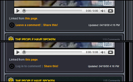
It's always the little things.


Comments

Whixh one's correct xD

hope you're joking. you can see the current black space and it's not nearly as wide as the bottom one.

Css is a little devil. I use a majority of developing time on my site fixing tiny problems. But it's always satisfying when it works AND works in all browsers.

good catch

Don't you love that feeling when you spot an error and fixing it isn't a huge ass hassle? I spent all of today fixing up small tiny little glitches all around my site (that only the designer would notice, lol, read: me).
I feel good knowing my debugging process is the same as yours, I always change the affect areas bg color to red or blue and then if its a spacing problem, I increase the padding / margin/width w/e by 30 pixels or something just to see what does what.
You rock Bob.

Yeah, trial-and-error is still my favorite method right out of the gate. I'm lucky to have my workflow down to a science and thanks to Tim a bunch of virtual machines handy to test on.

I started a job as a CSS developer a few weeks ago. Debugging CSS for IE is always the most infuriating part of the job. The IE Developer toolbar helps but I prefer Firebug. This job would be so much easier if people would finally just dump IE and switch to Firefox. Oh well.

I am also drunk right now. Cheers!

Rob got me hooked on Firebug only recently. Before that I was using solely a toolbar developed by this guy: http://chrispederick.com/work/web -developer/

Sadly, it's not nearly as helpful as Firebug but it's still got some really handy features that I can't un-learn the key commands for. Frequently when I visit a site, before I know what's happening I'm hitting "command-shift-s" to turn off their style sheets to see how the site looks without them. :)

IE is one big headache.

Sometimes I consider simply disabling a page for IE users rather than fix it if the page is compliant and works in FF/Opera/safari, out of frustration. But that wouldn't be very nice.

There is something to be said for having a site that might not be as pretty in IE but at least functional. When I first started styling Newgrounds I asked politely if we could have a site that was pixel-perfect in in FF/Opera/safari/IE7 and then just have a slightly different version (read: not perfectly styled, but close enough) for IE6. The answer was no. :)

But for most sites and people, having different looks for different browsers is a perfectly acceptable solution, as long as they're all equally functional.

I am glad i quit computer clases now
i would be doing that stuff and i would be placing my fist through the screen

I only got into CSS because i was too busy working for our student newspaper to be bothered with my college programming classes. If only I had devoted more time to give programming a fair shot I probably would have really liked it.

I really wanted to stop caring about IE users.
Its like if they are used to using a browser that doesn't follow net rules then they must be accustomed to a bad web experience anyways.

Buuut....IE users make up a HUGE chunk of web surfers...
:<

See my response to BigFuzzyKitten.

(Also, kitty crew commenting on my userpage? I'm pretty stoked!)

I liked your duck crossword picture. It was nice of AlicetheDroog to make you it. Someone should make you a harder one, with harder duck related questions.

I'm not volunteering. :(

Try Opera.

...Ducks?

i like the little duckys,bob.

Long time no see...

Long time no see...

Don't worry, only n00bs use IE. You can forget them for now, at least, until Microsoft rules the world. They you'll probably start having to make stuff for them.

Hello, I was told to confirm with you for my addition to the General Forum moderation. I gladly accept.

Thank you.

P.S. ^ was a prank by someone who could disguise e-mails.

the e-mail was sent by wadefulp@newgrounds.com

Disregard my last comment. I am truly sorry for the confusion, but I just figured out that the e-mail sent to me is fake, since the address used was WadeFulp@newgrounds.com, while Wade's e-mail is wade@newgrounds.com

I was fooled since the e-mail was @newgrounds.com, which I thought couldn't come from nothing but an official source. Maybe you guys should put an eye on that. If you want to, I could re-send it to you or something.

Again, sorry for any inconvenient. Thanks.

in the first shot the "Log in to comment" part was yellow, the 2nd shot, it was grey

Ducks are on the horizon.